
I have been trying to make a proper usable curve now but haven’t succeeded yet. This had to do with a couple of things, firstly my inconsistent coating. I found a single coating to give too little density on the paper but a double coat (while letting the paper dry in between) to give unevenness, looking really messy. So, I got back to single coating but more properly. This works as the last two coats looked really good (to me at least).
Secondly I have not yet determined proper exposure time of the paper. This will be my next step before attempting another go at the grayscale chart for the curve. Have to get things right from the start!
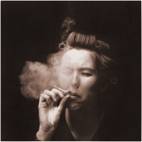
Anyway, I had one photo in mind which I made 3 years ago on 120 color film 6×6 (can’t recall the exact one right now, probably Kodak Portra 160VC) and thought it would be great for this process. I scanned the negative, turned it into a black-and-white and printed it without and with a curve which didn’t seem to my liking. The curve caused some solarization to occur so I’ll have to work on that.
The one without a curve is flawed in a way that the light tones in the hand for example appear blown out. This also happens on the forehead. But since I am kind of proud I would like to share it 😉 A modified version with a proper curve will follow a couple of posts down the road and I will compare it side-by-side when it does.
Paper used: Fabriano Artistico LS
Single coated paper 24×30 cm
Exposure time: 8:30 minutes

Making a proper scan of a van dyke print also seems like a challenge. The real print looks nicer.
Anyway, it’s nice to be working out a new workflow with this, naming the files, the negatives and the prints and making it seem coherent so you can actually learn from the three when combining the data.. It is strange however to be sitting behind a laptop in my darkroom, feels a bit awkward and skewed even. Always happy when I can get back to the ‘analogue’ way of working 😉
More to follow soon!

I’m intrigued with the work you’re doing with these prints. I can’t wait to try either salt, albumen, or van dyke printing. I can’t decide. I look forward to seeing more!